Showing posts with label typography. Show all posts

Saturday, January 14, 2012

Once the bride, now again the bridesmaid

I think I'm still behind in posting images of my own wedding invitations (bad designer!) and I promise they're coming, but in the meantime I just finished labeling and stamping my sister's save the dates and couldn't wait to get them into the public eye.

She and her fiancĂ© Jason LOVE their dogs–so much so that the save the date introduces them as the bride and groom with the fun line "it's not just puppy love". I'm going to say now that there wasn't MUCH puppy love doing the photoshoot with those poor dogs, but I think they now understand the pressure of having to fit into a wedding dress.

We went with an oversized 9" x 12" invitation and rolled it into mailing tubes for ultimate splash when received. The Barbie pink color palette will continue into future wedding items from invitation to bridesmaid dresses. I can't wait.


Monday, December 5, 2011

PMS or political commentary?

Not the normal optimism at the otherwise confident (though odd) Hamlin's Pharmacy this Monday afternoon. There's a prescription to help that, just sayin'.


Monday, November 7, 2011

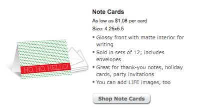
Ho, ho, hello there Holidays!

I realize my blogging has been pretty lackluster over the last month, but I finally feel like I'm back in the creative swing of things so hopefully will be posting more regularly. And what a better kick in the pants of inspiration than when I opened up the Snapfish holiday catalog over the weekend and one of my card designs was in there! Check out more designs at Snapfish.com.

Saturday, July 2, 2011

Excited for a day at the beach...and type class!

This Friday we went to Wilmington for a mini vacation, and while Mike was most excited about getting some beach time, I got (probably too much of) a kick out of the name of our hotel. The Clarendon Inn uses the Clarendon typeface for its logo! (chicken or egg on whether the hotel chose it's name based on the font or not)


Curiously, the bed and breakfast across the street also uses Clarendon font; isn't that Competitive Branding 101?

Friday, July 1, 2011

You say 'Crazy', I say 'Creative'

But if I were obsessed enough with the typeface and OBVIOUS font size difference in the logo of the driver in front of me today (the 'olin' is definitely larger than 'fairweather'), isn't that a testament to how meticulous I will be when I design an invitation?

Monday, December 13, 2010

The good, the great and the really expensive from NYC this weekend

The good:
-Art Nouveau typography on one of my old stomping ground streets. I suppose I was always too focused on Paper Presentation to ever look up.
-Apartment 48 and their innovative sign-hanging techniques. If only there was a little bird perched on that branch...

The great:
-Italian cookies (as always) and miniature black and whites!
-The BUST magazine craft fair that my friend and I stumbled into, and the best. company. name. ever.

The really expensive:
-$18 Baked Alaska at DBGB... ironically a similar hue as the $1.00 rainbow cookie from Brooklyn. Daniel Boulud, I'm onto your inspiration.

A great trip and amazingly warmer than the Southern weather that I returned home to.


Friday, December 3, 2010

F as in Friday! D as in Donut!

What a better way to teach your children to read than with the happiest fod on earth? Thank you, Jen and Finn for making my morning just that much better.

Monday, November 29, 2010

Monday, November 22, 2010

Ho, Ho, Hello there Snapfish

I've recently started designing cards & invitations for Snapfish so I visit the site regularly to check on my little design-babies. And today I felt like a parent who's kid made Honor Roll: one of my cards was chosen as their front page note card design!


Monday, November 1, 2010

Bad Kerning, Blowing Rock-style

Sassyfras is anything BUT sassy looking here...

Friday, October 15, 2010

Miniature photo gallery, part two

Now just to wait until some New Yorkers come through here and see if they recognize where each photo was from! Mmmm I'd love a Montaco right about now.


Thursday, September 23, 2010

Thanks mom. I mean, Hamlin's.

 
Just a little guilt trip life lesson to start my Thursday morning. Though not as creatively worded as last week's thought of the day.

Wednesday, September 8, 2010

Happy bel-yay-ted birthday to me

How Whistler's Mother is this pastoral iPhone shot of my amaaaaaaazing new coffee-drinking accessories? Thank you to my caffeine addiction and to Liz for making this happen.

Tuesday, August 24, 2010

No wait, THIS is better than cable


(Note: Yes, I did take this photo from the safety of my own car. I'm not really one of those people who would die for the sake of their art.)

(Note: And no, I'm not really considering this photo 'art')

Tuesday, July 13, 2010

Signed, sealed, delivered and stored

So this whole 'moving in with my fiance' thing has made me second-guess everything I've kept since the dawn of living alone and having the inalienable right to keep (and collect) whatever the hell I want as a single person.

Call me a sentimentalist (and maybe a pack rat) but before I get rid of possibly the coolest packing envelope I've gotten (long before the whole 'stick multiple stamps to make up the correct postage' thing was hip) I wanted to show it a little love.

From my no-longer in Chicago friend Robyn, to the definitely no-longer in Brooklyn Karen.


Thursday, July 8, 2010

Tuesday, June 22, 2010

I'm suddenly in the mood to spend a lot of money

Wait, I'm not at Barney's Co-Op? Well, in my imagination I'm totally there...

I'm a Gemini, but I might love these signs more

My trip to Greensboro today reminded me of how much I love old buildings and the typography associated with them.